My bad feelings for the common pie charts come from a context where I should make sense of what’s presented. If a designer of a pie chart just want the viewer to be amazed by a well selected color palette, then I’m fine with using the pie chart. Most pie charts I encounter however, try to convince the viewer that the colors and sectors should provide information that will give insight and knowledge, maybe even be used as a basis for decisions.
A warning before we continue: By reading this post to the end you will also probably come to the conclusion that pie charts are the wrong choice in many cases, and most presentations, publications, authors, etc. that use them, will not be looked upon as serious anymore. Ever.
Basics of a pie chart
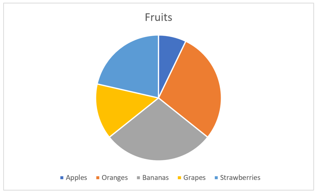
Most are familiar with the pie chart, and Excel gives a good job of making one quickly:
Here, I have some fruits for the categories and their corresponding values. Each sector, indicated by a color, in the pie chart will now represent the fruit and the size of the sector its value of the total. The size is here either the area or the angle, both give the same. Excel does a good job at picking nice colors and even puts a legend below the chart so we see what fruit belongs to which color.
The information you get from the pie chart
Let’s say the pie chart above represented something important, and I wanted to have the pie chart to really enlighten the audience instead of just showing the numbers. The easy one you see without thinking is that apples constitute the smallest value. Oranges and bananas seem equal, strawberries larger than grapes. The values as fractions of the whole is hard to see without thinking and comparing. It’s impossible to see if oranges and bananas are equal without pulling out a ruler and measure. Another challenge is that the legend is below the pie and you have to move your eyes around to find what color represents what fruit.
Fixing the pie chart
My luck with the first pie chart was not that great as I wanted the audience to really get the numbers, not just see pretty colors. Back to Excel and tweaking how information is represented:
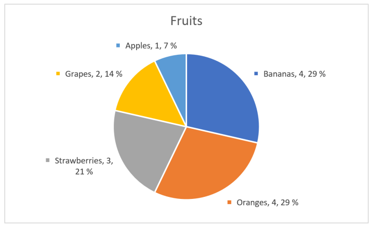
That’s better! First I sorted values from high to low, then removed the main legend and added labels with fruit category, value and percentage next to the pie section. If the illustration was interactive, I could also have added tool tips showing the numbers when the user’s cursor or similar enters a sector. But, wait! I fixed the pie chart by adding numbers in addition to the chart, so I haven’t really fixed anything and could instead just have shown the numbers as a table:

Using numbers in addition to graphical elements is a good choice in many visualizations, but the graphical elements’ mission is to make the numbers easier to interpret, not the opposite.
The basics of visual perception
Visual perception is a combination of how light enters our eyes and how the brain interprets this into something meaningful. There are only a few fundamental principles that make up this perception, and Gestalt theories that were formulated a hundred years ago are still valid.
Our mission in this blog post is to see how the information hidden in the pie chart can be expressed better, so we will thus start with the two most precise and simple fundamentals: Length and position (in two dimensions).
We are very good at interpreting length. The natural chart for our numbers using length, instead of angle or area as in the pie chart, will be a bar chart:
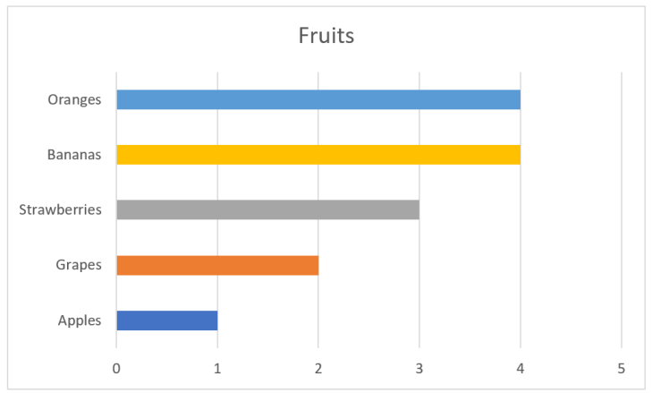
As you can see, interpreting the values is very easy. The fruits are also ordered from big to small values. The colors I added is just eye candy and gives nothing for the interpretation. Same can be said about the vertical lines. When we have charts of this type and have enough space, it’s common to also have numbers on the value axis. We can get away with all these elements:
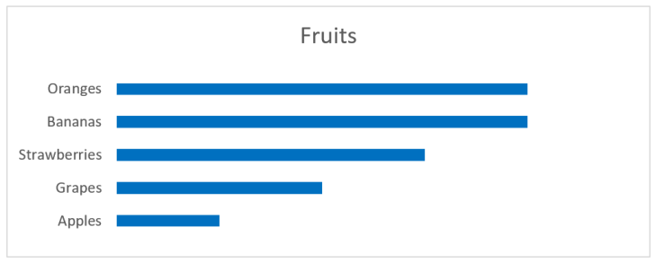
Still, we can see that grapes are around half the size of the largest values, apples are half of grapes, etc. And we don’t need to move our eyes to see where the values for strawberries are, since the principle of proximity relates the label to the rectangle representing the value. The principle of continuity let’s us skip the base line at value 0, since all rectangles are aligned.
Looking at position, we may have a chart like this:
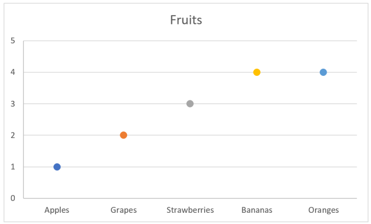
In this chart I have the data labels along the x-axis, which is not something I recommend. This makes it harder to compare values, and if there are many values to be compared, then vertical stacking is preferred. Many labels and long labels may let you start thinking about rotating the labels in the chart above, but be careful about this. The point is still that position is a good value indicator.
Where are we going?
So far we’ve seen that a bar chart gives a better perception about values as the reader doesn’t have to think to much to interpret the data. This also means that we can add more information to the chart without mentally overloading the reader.
Let’s imagine that the bar chart above represents some sales of fruits in a given period. On itself this gives a limited basis for decision making. Is it good or bad that apples are approximate one third of oranges? Are we following a plan? How far are we from a goal? Let’s add something more to the chart:
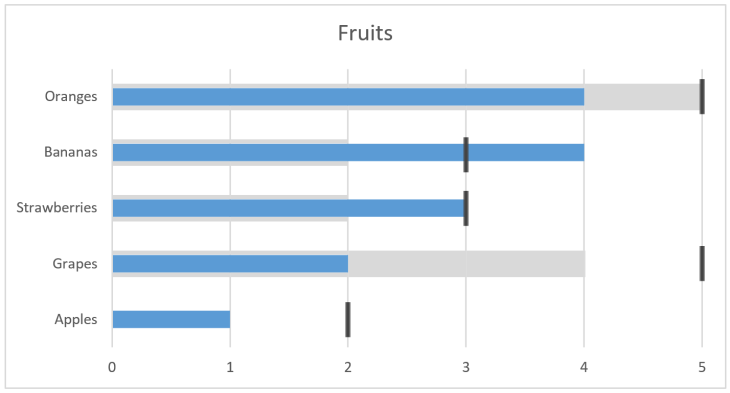
We can interpret this chart as last year the value of oranges was 5 and our target now is 5, but we currently are at 4. For grapes we had 4 and targets 5, but only are at 2, whilst apples was 0 (no grey) and with target 2. So, by adding this we see that for apples we are halfway to our target, but grapes are only half of what we had last period and the target is even further away. Seems like we could remove marketing from bananas, which have done very well, and strawberries, and put more effort in grapes which are far behind.
So far we’ve only looked at a few fundamental principles of visual perception. We will save the rest for later posts as we will then bring in these principles with examples of usage.
The bigger picture
The pie chart is only an example, a very good one though, where we have designed something that is not optimal for human usage. As humans encounter more than pie charts in a normal life, all things that need us to interact or make decisions from a visual stand point should use the fundamental principles that are known. Those principles can be hard to explore as we move though our four dimensional space-time world, but as you will learn to see, you will find what’s good design and what’s hopeless and could make room for human errors.