Traffic light

The traffic light (a.k.a. the management view)

Over the years, the most common requirement for a dashboard I encounter is that we need a simple view for the upper management. They don’t have time to dive into details and in it’s most simplistic form they want to have a traffic light view, telling them all is good or not. In this post, I will discuss the difficulties we face when trying to make such a dashboard and why it will be a bad choice if the dashboard will be used for making decisions in the next phase.
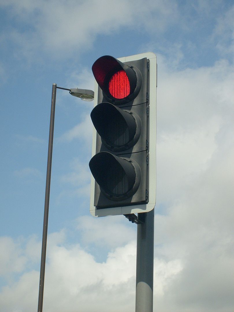
The traffic light

Traffic light

Traffic light (By Unisouth – Own work, CC BY 3.0, https://commons.wikimedia.org/w/index.php?curid=3934535)

The traffic light is a well working concept. For it’s domain, controlling traffic, it’s easy to understand and universal. Crossing a street as a pedestrian is a binary decision – you either wait or go. Same when driving a car – it’s either your turn to drive or you should be standing still letting other traffic go. It’s probably one of the most effective decision support tools we have for damage prevention.

What is easy to forget is that a traffic light is not the only sensory input you have when crossing streets. If you are a pedestrian, you eyes and ears will pick up signals that can tell you not to fully trust the traffic light. Like, an ambulance might be crossing at high speed. On it’s own, a traffic light can be a dangerous single source for decisions, and it should be augmented with other inputs.

What managers want

Of course there are no single right answer to what managers want. We are often told that time will be a significant constraint, and from there the conclusion will be that they need a dashboard with few elements, and the one with the least elements we know is the traffic light. My first argument is that managers want to have a good view of the organization status. The more knowledge they have, the better the data driven decisions will be in most cases. The traffic light, even though it will take micro seconds to understand, will not give enough detailed insights.

My other argument is that there are less correlation between the number of elements in a dashboard and the time needed to interpret the information than most think, as it will depend on how elements are presented. To it’s extreme, I can argue that having hundreds of elements will in fact be good, which we will see later.

Key performance indicators

A dashboard could benefit from having some kind of interactive drill-down or more details when a user reads from the top of screen to the bottom. Often key performance indicators (KPIs) are used in headers, and it’s these KPIs that also give the data for the traffic light constructions. The challenge will then be to

  • Determine what will be good KPIs
  • Determine the visualization of the KPIs

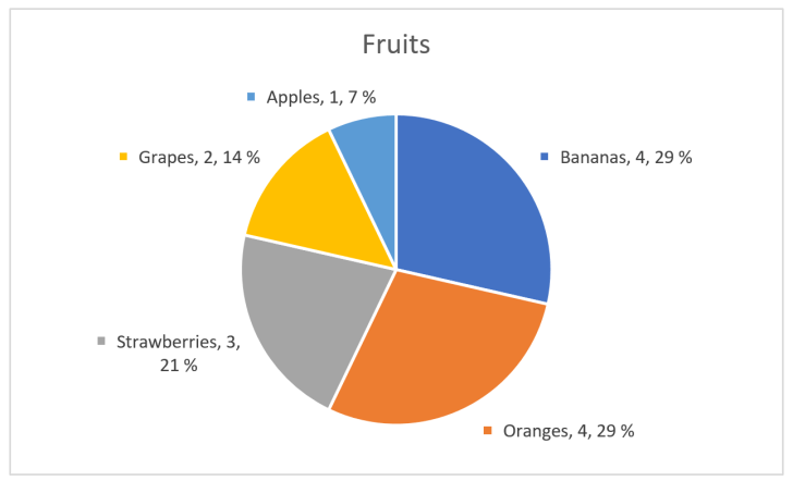
As an example, we can say that we want a sales dashboard. Sales will have a budget, a cost, and an income, and we want to track current year to previous years and budget. Managers are often involved in setting budgets, so a report will typically be to say that you are on the budget or not – i.e. a binary decision and then we think it’s a good idea to have a traffic light, right? A budget is usually an estimation of cost and income, thus profit, to come. So what does it mean that you are on the budget – you have a cost that is comparable to budget, you have an income that’s comparable, or you compare the profit? Are you comparing the values directly or some percentage or other calculation?
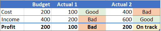
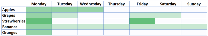
Actual vs budget

Actual vs budget

The example in the table shows one budget and two actual situations. The first shows that you are not spending over budget, but you are not making so much money either, so in value the profit is below budget. In percentage, you still earn twice as much as the cost, so if this was the metric it would have been on track. The second example has some overspending, but the income is above budget and profit is where it should be according to budget. For our traffic light dashboard, it will not be obvious how we should code the different scenarios, as both could be fine or bad.

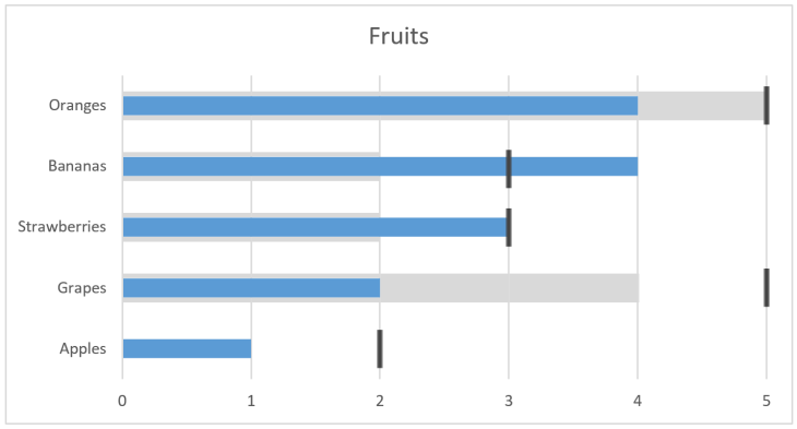
Problem arises however, when a traffic light dashboard is presented for managers. Let’s say we base a KPI on new profit. First scenario gives then a bad indicator, and then the managers will of course question why things have gone bad. In the second scenario, you tell them everything is fine, even though you have doubled the costs, for which managers probably should have been informed. It’s easy to see that traffic lights do a good job of hiding information and rising more questions than answers. An easy fix would be adding more traffic lights – one for each parameter, as more or less have in the table. Then it’s easier to see the cause of good or bad profit. Also, including numbers for budget and actual will give additional information for how good or bad the situation is. Thus, having more elements in a dashboard is actually a good thing.

Using statistics

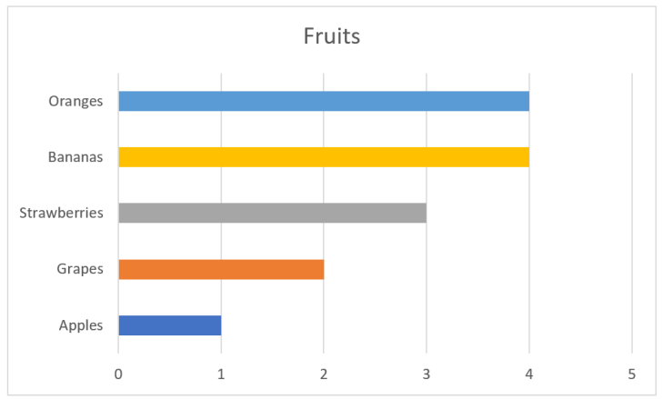
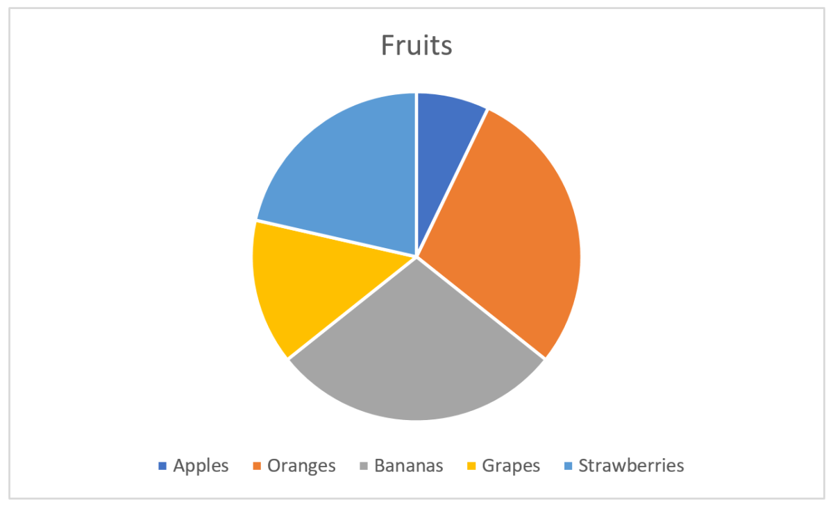
Since this post is about taking intelligent decisions based on data, a cautionary note should also be said about using averages. Average is commonly used as a KPI, so it is important to know what it actually represents, and not represents. The average is calculated for a set of values and it is an indication of the distribution of the values. As an example, let’s assume we are selling fruits across Europe and our KPI is based on the percentage change from 2018 to 2019 (this is by purpose as percentage will give large values if the initial was very low, e.g. if we go from 100 to 110 this is an increase by 10%, but if we go from 10 to 20, same amount as before, this is 100% increase).

Averages

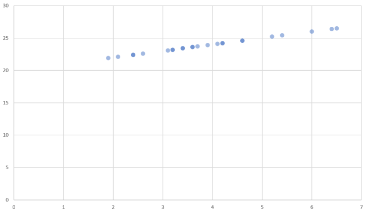
Averages (showing a subset of the values)

On average we are 173% up. Not bad at all and managers can be very happy! Actually, a lot of countries have gone down, but we have a couple outliers with very high percentages. The average of percentage says we have more than doubled, but the average absolute value is in fact very small (2.3). We still want percentage to be our KPI, so the problem is the use of average. Let’s look at a distribution by just plugging the values into Excel’s histogram:

Percentage distribution

Percentage distribution

Immediately it should be clear that the outliers are causing the average to be complete off with regards to what we actually want. Data that is unevenly distributed should not use average, as average more or less requires a normal distribution. Too bad that average is so commonly used in our language that we use it without considering the consequences. A better statistical function would be the median. This is basically sorting the values and picking the one in the middle. For our percentages, this would give a number close to 0%.

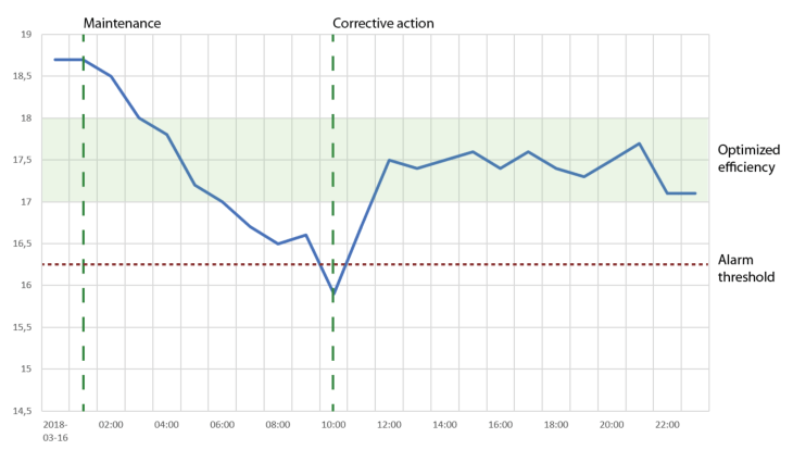
Intelligent decisions

In order to make intelligent decisions, managers should be presented with KPIs and explanations for those data. For our sales example, a bad profit over a year could be augmented with e.g. monthly values (or deviations from budget). There one can see that the first quarter was hard, but the rest of the year showed a positive trend, i.e. keep on doing the same thing. Or that even we are on budget, the last couple months had a negative trend so additional actions could be necessary. In Excel, you can add sparklines. In addition, showing tabular data, maybe color code values to show good and bad, is in fact easy to understand. Thus, I believe one can show a large number of values, together with explanatory charts like a sparkline, and have a dashboard that will give much more intelligent decisions than a traffic light.

The one right chart for your data

In my previous blog post, No pie charts – The basics of visual perception, I ranted about the poor visual perception of pie charts and had examples about better ways of give the reader insight. This post will try to give an overview of all charts and diagrams I find useful, dependent of the data.

A good overview of supported charts for different libraries and tools can be found at The chartmaker directory. In this post, I will only look at a subset of the charts presented there, but will in later posts come back to how we can use specialized and customized charts to see how this can provide more insight to data. Often, this is accompanied with calculations before presentation. And, we can also combine several charts into a dashboard, and use the presentation medium to our advantage. Now, we concentrate on the basics…let’s go!

Time series

Personally, I find time series very interesting. They are a natural part of our daily life, and even though they are simple, they contain much information. We will distinguish between univariate and multivariate series. For simplicity, we can say that a univariate series will have a time component and one corresponding value, whilst a multivariate can have several variables at the same time. Multivariate is a big research field when it comes to analysis and statistics.

Observations at points

When you have observations that are recorded along with their time stamps, then generally the choice of chart should be a line chart. Time should be along the x-axis, from left to right, and values should be along the y-axis.

Time series in a generic line chart

Time series in a generic line chart

If the you want a smoother chart between points, then many libraries let you chose spline. Spline will interpolate a polynomial between the points so it seems like the observation were continuous.

Time axis

The example chart above has no values on the time axis. Having values shown on the y-axis is easy, as you can just put them there more or less, but a point in time can consist of date and time information which should be formatted correctly. Consider the following chart:

Time series - with UTC time stamps

Time series – with UTC time stamps

This chart will not be visually pleasing as the time labels are too long and too many. We can remove half of them and show only the time component without confusing the reader, like this:

Time series - formatted time stamps

Time series – formatted time stamps

Have look at both charts and see where it’s easiest to spot the time of the minimum value!

There are also some general rules I apply to time axis considering the resolution of the data. When we have values that are calculated over a period and then want to record that calculation, it will be mathematically correct to set the timestamp at the end of the period. E.g. if I want the average of the values above, over a day, I will get 17.4 at 2018-03-17T00:00:00. Notice that this time stamp actually is the next day. It’s not 23:59:59 or something even closer to midnight, but a time stamp of 00:00:00 indicates up to, but not including, midnight when we have a calculation like ours. However, when showing this value in a chart, that value should appear without a time component, and for the day 2018-03-16. Using a column chart may be a better choice in some cases, e.g. if we say that the values in our chart was the hourly averages, then we could visualize this as:

Column chart

Column chart

Another detail to consider is time stamps with time zone offset. In order to synchronize time stamps, they should be recorded as UTC or with the time zone offset. When presenting those data to the user, one must take into account what the user expects in terms of time zone information. Most users will not care and expect data to be shown with same time zone as they originated, but this can differ. Companies with branches in different time zones will face this challenge e.g. when looking at sales on Monday. Then they probably will have local Monday for each branch. Additional challenges can arise when we have daylight savings switching, where a day suddenly gets 25 or 23 hours.

Augmenting the chart

By augmenting the chart, I mean adding additional information to the chart that will give the user addition insight in e.g. what chart properties like maximums and minimums represent. It’s common to have a threshold band in which the data values are supposed to be, but one can also add a number of KPIs.

If we look at our data set, the negative trend that had a minimum and then seemed to stabilize at a somewhat middle value, could be explained by adding information as shown in the chart below:

Augmented chart

Augmented chart

The skilled reader will now see that somebody did maintenance on something that the data set represents. After this, the efficiency dropped to a minimum, where an alarm was triggered and a corrective action performed, and then the efficiency was measured to be in a band indicated as the optimized.

More than one line in the same chart

When we have data sets with same time stamps, or there’s a need for comparing two or more separate data sets by shifting the time stamps to some periodicity, then we can add more lines to our chart. One thing to consider here is proper use of colors, as color often is used to distinguish between the data sets. Tools like ColorBrewer can be very valuable in these cases. Multiple lines would require some kind of legend to explain the color coding, as shown in the following chart:

Line chart - multiple data sets

Line chart – multiple data sets

The limitation for how many lines to show depends. If you want to show each line in a separate color, then stop at 4-5. If you want to highlight one line together with a huge number of others, make that line in a color and the rest in a common gray or similar. The latter will give the user a good sense of how the highlighted data set is compared to the spread of the rest. Which brings us into the question: Why do you want to show a huge number of charts? Are there any special pattern you try to see, like last value, minimums or maximums, trends or outliers? If so, then consider other visualizations where those points of interest are compared.

Multiple charts for comparisons

Instead of having all data sets plotted in one chart, there’s also the option to use multiple charts. When the intention is still to compare values, the one important thing is to use the same value range for all y-axis. The following example shows how difficult it is to compare Series 4 with the rest since the y-axis differs:

Multiple time series - Not same value range on y-axis

Multiple time series – Not same value range on y-axis

Trending and forecasting

One of the main reason for using a line chart for time series will be because time series represents development over time. Humans will then have a natural way of see trending and forecast future values. The two most useful trends to be plotted along the time series will be a linear or exponential, but this depends on the nature of the data and what pattern to expect.

Time series - with a linear trend line

Time series – with a linear trend line

When not to use a line chart for time series

In many cases, time is not the important component. Probably in more cases that we believe, as the line chart with time on the x-axis is the go-to chart for most people. As for all (useful) charts, they are just there to make it easier to gain insight. As I’ve said previously, if you e.g. are after maximum values, then present this as a number (and time) instead. Instead of plotting several data sets in one or more charts for comparison, then plot the maximum in bar charts. And similarly with other properties.

Another case could be data sets along geographical coordinates. Typically, then a map is used, and it will make more sense to have distance instead of time for showing what happened at certain points, like my chart from Strava for a bike trip shows:

Charts from Strava

Charts from Strava

Comparing quantitative data

In many cases, a simple bar or column chart will do the job when we want to compare quantitative data. This was also shown in No pie charts – The basics of visual perception.

Bar chart

Bar chart

It’s also easy to add additional information to the bar chart, like targets.

Patterns in quantitative data

When there are patterns in the data that should be compared across different categorical values, we have the option of using multiple charts or have multiple elements for each category in one chart. Both can end up with hard to read charts. Another chart that can be useful in these cases are heat maps.

Simple heatmap

Simple heatmap

Let’s say we try to understand more about the quantities for our fruits in the example above. We now want to see if we can spot any patterns, say, for the days of the week. When we plot the values in an heat map where the color indicate a quantitative value, we can draw some conclusions, like

  • Mondays are the best for all fruits
  • Apples are best early in the week
  • Grapes seems to have good days followed by two bad
  • Strawberries have the highest number, but only for two days
  • Bananas don’t depend so much on days
  • Oranges are for Mondays
  • Thursdays and Sundays are the two worst days in the week

The next thing from this chart is to take some action. Maybe I want to examine closer why strawberries peak at Mondays and Fridays, maybe we go out of stock on Monday and have to wait until Friday to get fresh ones, maybe we can price them higher at the days with most demand, etc.

Finding correlations in data sets

In cases where two data sets should correlate, a scatter plot may reveal the relations. The chart below takes one point from each data set and mark this with a circle. The plot clearly shows a linear correlation between the sets as all points lie on a straight line.

Scatter plot with correlation in data sets

Scatter plot with correlation in data sets

A famous set of data is Anscombe’s quartet. The numbers in these sets don’t give the reader any easy insight, but scatter plots make this obvious.

To sum up

This ended to be a long post about time series, and not so much about the rest of charts that exist. However, the charts presented here really make up some of the basis for data visualization, and they can provide good insights to the data they represent. Often, the real challenge is not to find the correct chart, but to examine and transform the data according to what question that should be answered.


No pie charts – The basics of visual perception

My bad feelings for the common pie charts come from a context where I should make sense of what’s presented. If a designer of a pie chart just want the viewer to be amazed by a well selected color palette, then I’m fine with using the pie chart. Most pie charts I encounter however, try to convince the viewer that the colors and sectors should provide information that will give insight and knowledge, maybe even be used as a basis for decisions.

A warning before we continue: By reading this post to the end you will also probably come to the conclusion that pie charts are the wrong choice in many cases, and most presentations, publications, authors, etc. that use them, will not be looked upon as serious anymore. Ever.

Basics of a pie chart

Most are familiar with the pie chart, and Excel gives a good job of making one quickly:

Pie chart


Here, I have some fruits for the categories and their corresponding values. Each sector, indicated by a color, in the pie chart will now represent the fruit and the size of the sector its value of the total. The size is here either the area or the angle, both give the same. Excel does a good job at picking nice colors and even puts a legend below the chart so we see what fruit belongs to which color.

The information you get from the pie chart

Let’s say the pie chart above represented something important, and I wanted to have the pie chart to really enlighten the audience instead of just showing the numbers. The easy one you see without thinking is that apples constitute the smallest value. Oranges and bananas seem equal, strawberries larger than grapes. The values as fractions of the whole is hard to see without thinking and comparing. It’s impossible to see if oranges and bananas are equal without pulling out a ruler and measure. Another challenge is that the legend is below the pie and you have to move your eyes around to find what color represents what fruit.

Fixing the pie chart

My luck with the first pie chart was not that great as I wanted the audience to really get the numbers, not just see pretty colors. Back to Excel and tweaking how information is represented:

Pie chart 2

That’s better! First I sorted values from high to low, then removed the main legend and added labels with fruit category, value and percentage next to the pie section. If the illustration was interactive, I could also have added tool tips showing the numbers when the user’s cursor or similar enters a sector. But, wait! I fixed the pie chart by adding numbers in addition to the chart, so I haven’t really fixed anything and could instead just have shown the numbers as a table:

Numbers for the pie chart

Using numbers in addition to graphical elements is a good choice in many visualizations, but the graphical elements’ mission is to make the numbers easier to interpret, not the opposite.

The basics of visual perception

Visual perception is a combination of how light enters our eyes and how the brain interprets this into something meaningful. There are only a few fundamental principles that make up this perception, and Gestalt theories that were formulated a hundred years ago are still valid.

Our mission in this blog post is to see how the information hidden in the pie chart can be expressed better, so we will thus start with the two most precise and simple fundamentals: Length and position (in two dimensions).

We are very good at interpreting length. The natural chart for our numbers using length, instead of angle or area as in the pie chart, will be a bar chart:

Bar chart

As you can see, interpreting the values is very easy. The fruits are also ordered from big to small values. The colors I added is just eye candy and gives nothing for the interpretation. Same can be said about the vertical lines. When we have charts of this type and have enough space, it’s common to also have numbers on the value axis. We can get away with all these elements:

Bar chart witout lines

Still, we can see that grapes are around half the size of the largest values, apples are half of grapes, etc. And we don’t need to move our eyes to see where the values for strawberries are, since the principle of proximity relates the label to the rectangle representing the value. The principle of continuity let’s us skip the base line at value 0, since all rectangles are aligned.

Looking at position, we may have a chart like this:

Dot chart

In this chart I have the data labels along the x-axis, which is not something I recommend. This makes it harder to compare values, and if there are many values to be compared, then vertical stacking is preferred. Many labels and long labels may let you start thinking about rotating the labels in the chart above, but be careful about this. The point is still that position is a good value indicator.

Where are we going?

So far we’ve seen that a bar chart gives a better perception about values as the reader doesn’t have to think to much to interpret the data. This also means that we can add more information to the chart without mentally overloading the reader.

Let’s imagine that the bar chart above represents some sales of fruits in a given period. On itself this gives a limited basis for decision making. Is it good or bad that apples are approximate one third of oranges? Are we following a plan? How far are we from a goal? Let’s add something more to the chart:

Bar chart with more information

We can interpret this chart as last year the value of oranges was 5 and our target now is 5, but we currently are at 4. For grapes we had 4 and targets 5, but only are at 2, whilst apples was 0 (no grey) and with target 2. So, by adding this we see that for apples we are halfway to our target, but grapes are only half of what we had last period and the target is even further away. Seems like we could remove marketing from bananas, which have done very well, and strawberries, and put more effort in grapes which are far behind.

So far we’ve only looked at a few fundamental principles of visual perception. We will save the rest for later posts as we will then bring in these principles with examples of usage.

The bigger picture

The pie chart is only an example, a very good one though, where we have designed something that is not optimal for human usage. As humans encounter more than pie charts in a normal life, all things that need us to interact or make decisions from a visual stand point should use the fundamental principles that are known. Those principles can be hard to explore as we move though our four dimensional space-time world, but as you will learn to see, you will find what’s good design and what’s hopeless and could make room for human errors.